Before the apps, the grammar.
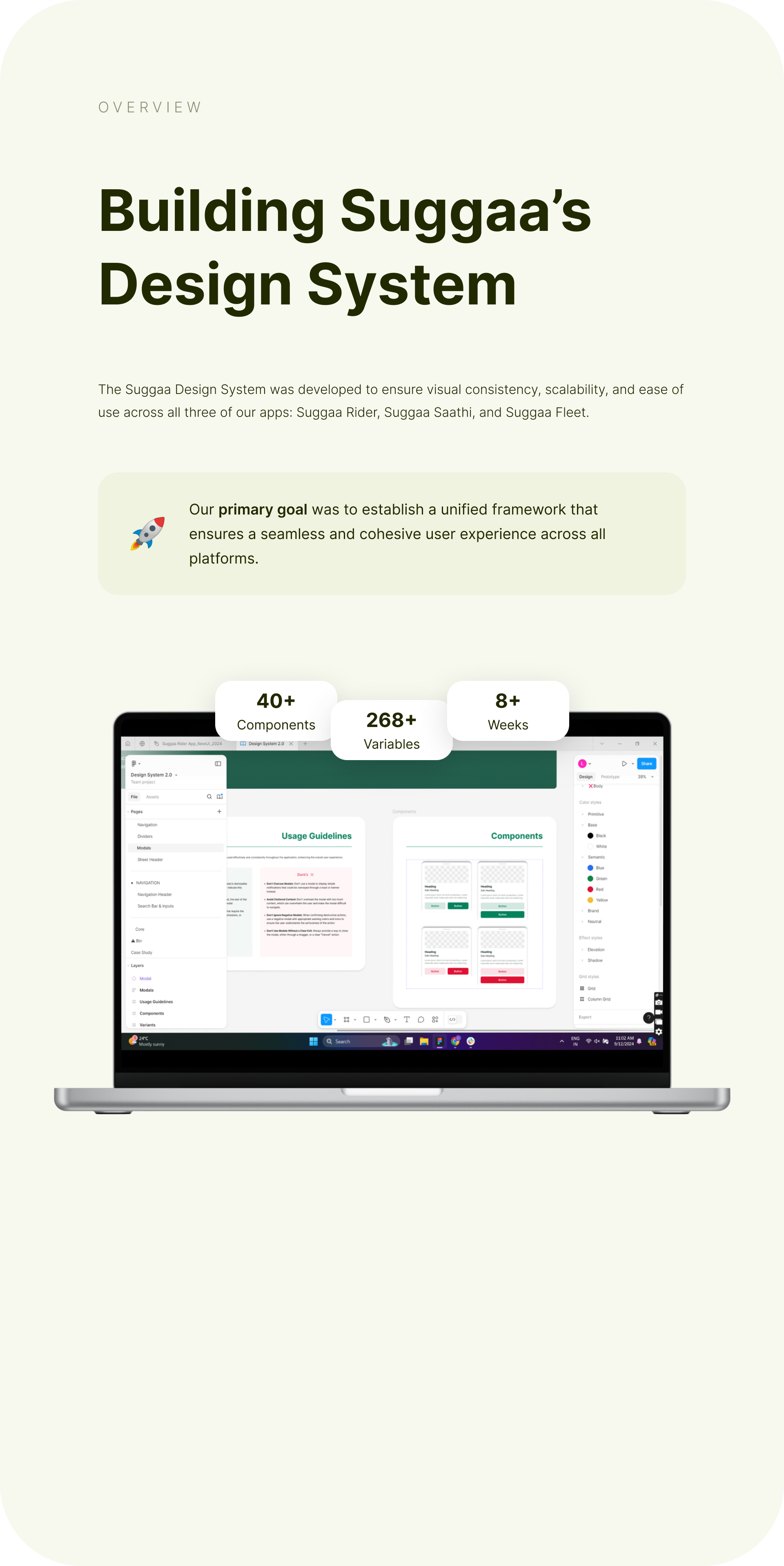
The only way a small team ships three synchronized apps is to stop designing screens and start designing the language they’re written in. Design System 2.0 is that language — for the rider app, the Saathi driver app and the Fleet console.
Three apps, one small team — consistency by default, not by heroics.
A ride-hailing product is three products pretending to be one: every flow crosses the rider app, the driver app and the console. Without a shared language, every feature becomes a job of designing the same thing three times and hoping they agree. The system makes them agree by default — tokens for every colour, space and type decision, and components that carry their own states, sizes and usage rules.
Tokens first, components second, screens last.
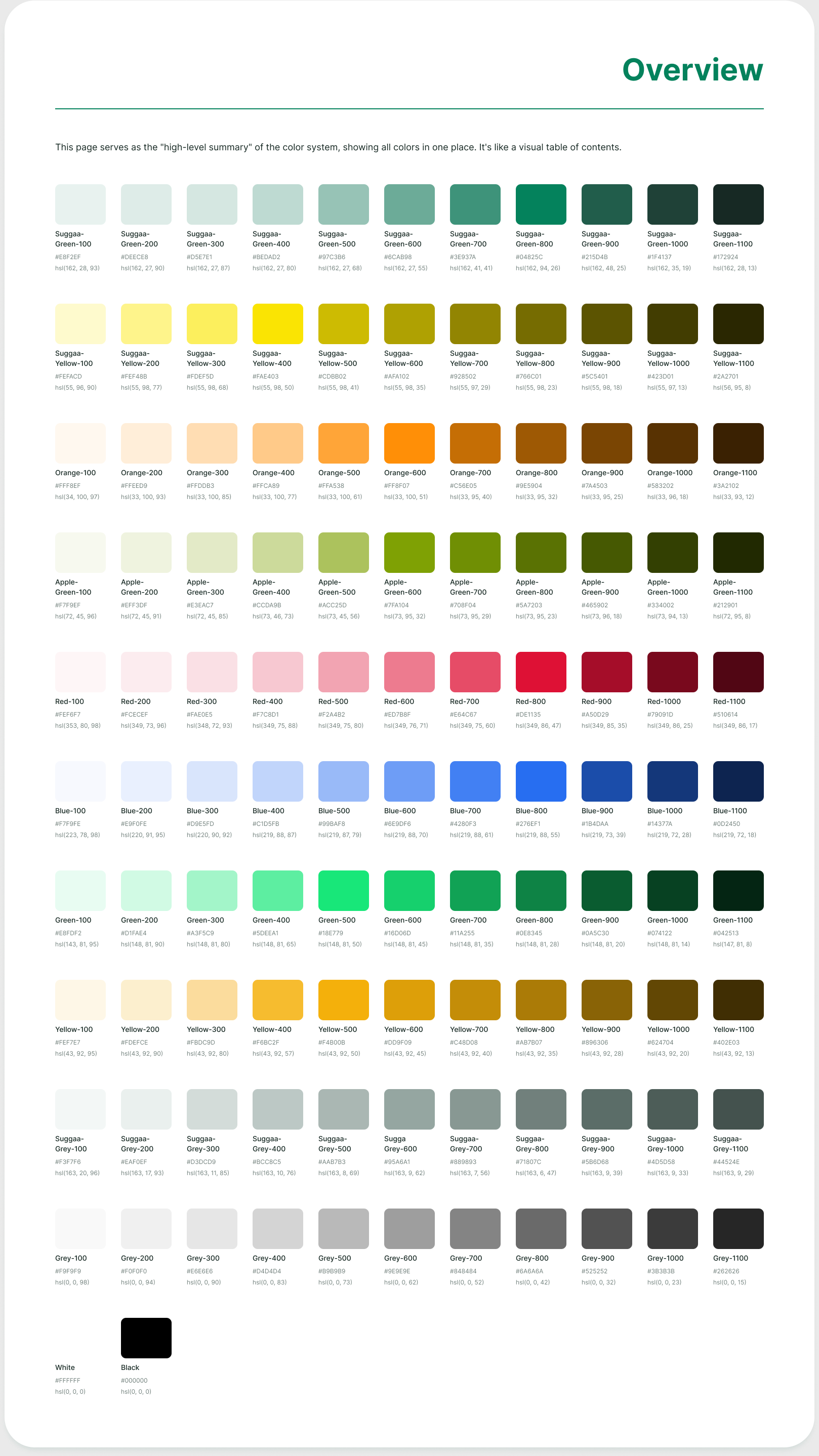
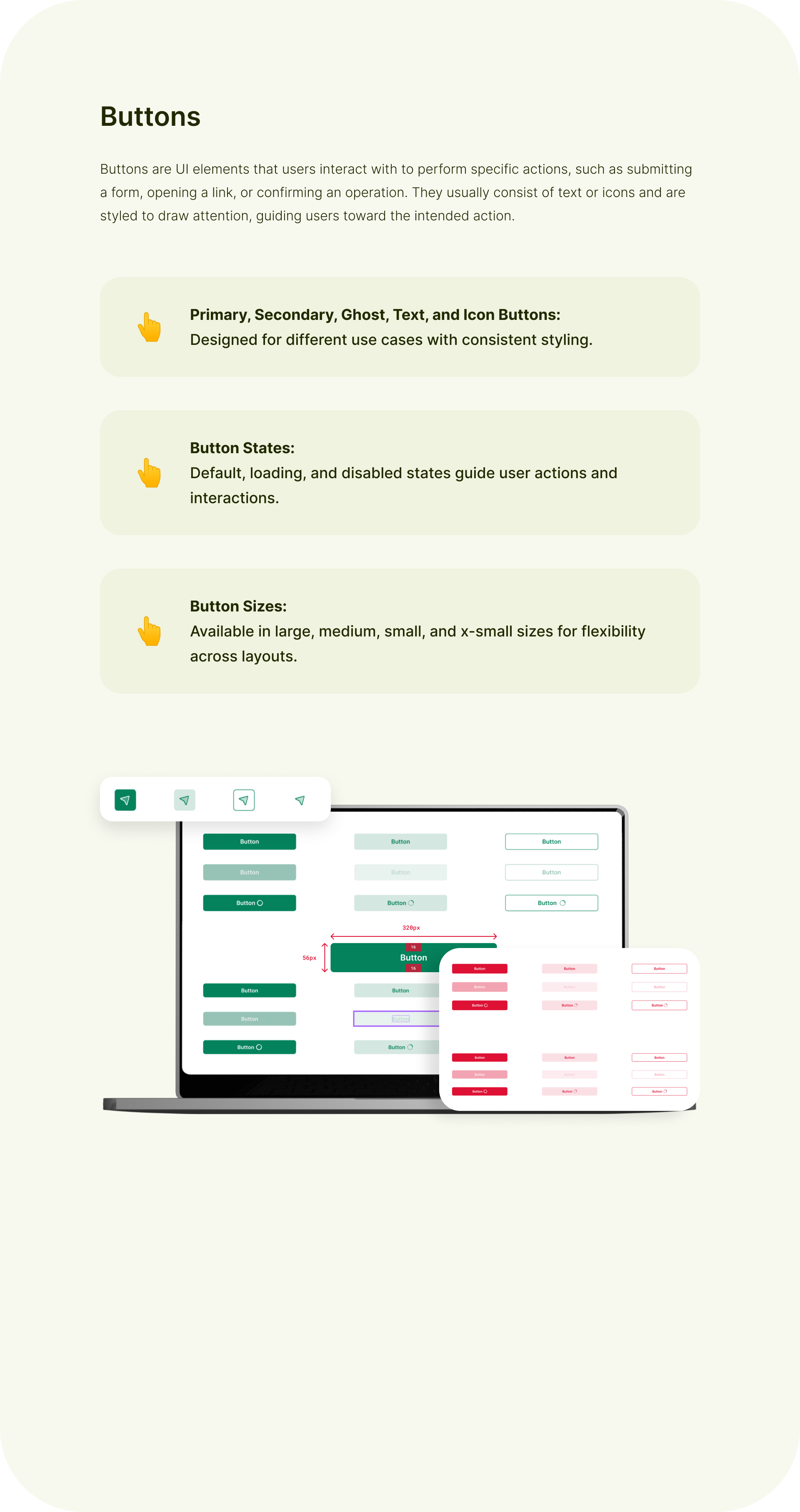
The foundations page reads like a table of contents for the brand: eleven-step scales for every palette — Suggaa Green to neutrals — each step a named token, so "which green?" stopped being a conversation. On top of that sit the component families: buttons with variants, states and sizes; inputs, pickers, badges, sheets, navigation — each with usage guidance baked into the file.
System 2.0 was crafted by the design duo I hired and led — Shubhanshu Singh & Latika Bhawnani — under my direction. Building the team that could build the system was the job.
New features and new cities shipped without the experience drifting.
With the system in place, the rider app, the Saathi app and the Fleet console stayed one product across five years and two city launches. And the team that built it could carry it without me in the room — the only real test of a design leader.
What I'd do differently: build it earlier. Version 1 was screens first, grammar later — we paid for that in rework when the driver app scaled. System 2.0 fixed it in eight weeks, but the lesson stuck: on a multi-app product the design system isn't a deliverable, it's the foundation you pour first. It's why every 0→1 I run now starts with the language, not the screens.
A design system that lets a small team ship like a big one — built inside your product, with your team.