Book in seconds.
Ride in minutes.
Suggaa is the honest taxi — an Indian ride-hailing startup that took on the giants with transparent pricing and a fleet built for Indian streets. The rider app is where that promise gets kept, 25,000+ riders at a time.
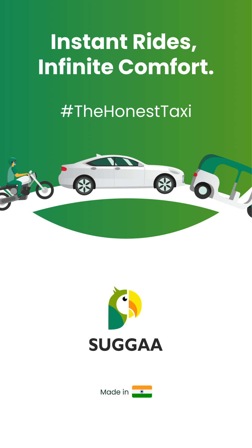
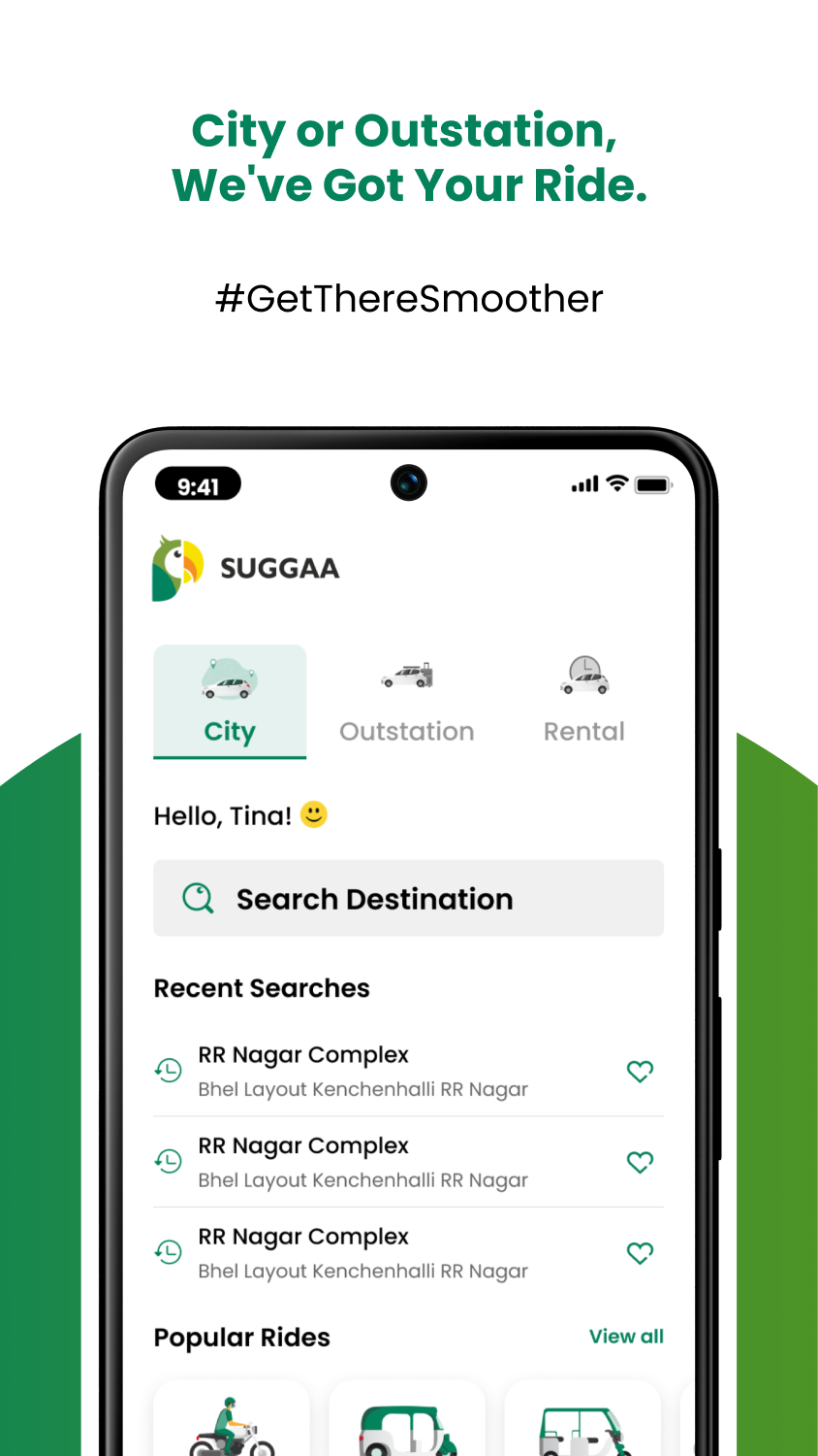
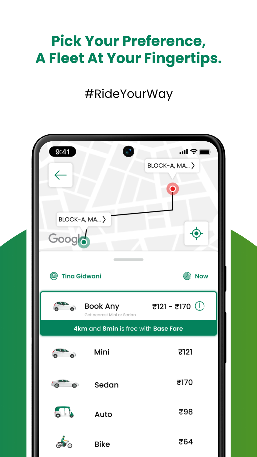
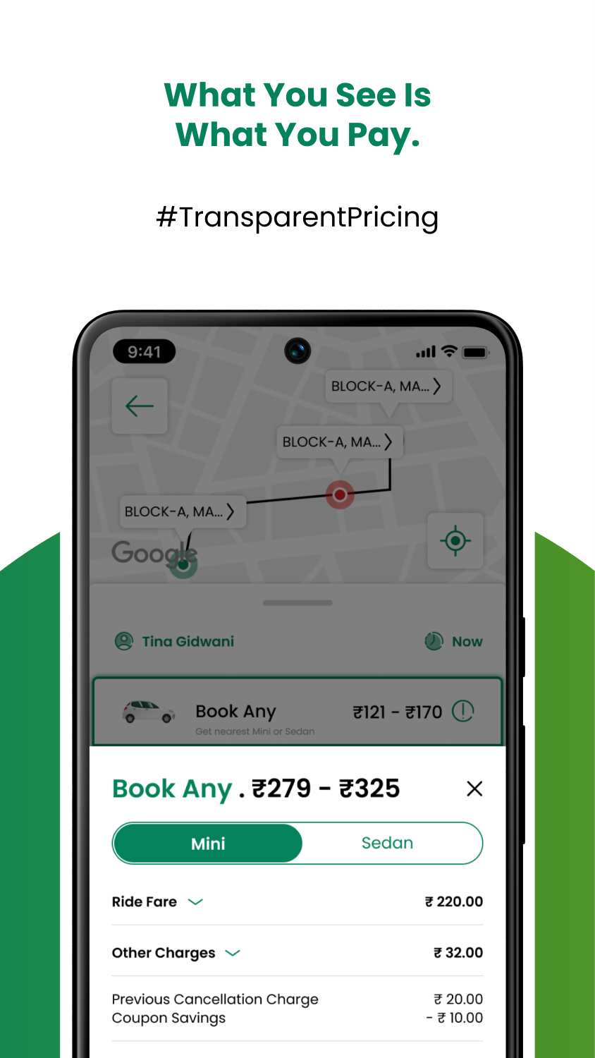
Fig. 01 — Store creatives, designed in-house. The brand promise in four frames.
Honesty had to fit on one screen.
We were putting bikes, autos, totos, minis and sedans on Indian streets against companies with thousand-person teams. The bet was focus — win the tier-2 cities the giants treated as afterthoughts, and win them with honesty: what you see is what you pay. The rider app is where that bet either works in five seconds or doesn't work at all.
So the home screen carries the whole promise: city ride, outstation trip or rental on one selector; your vehicle class with the real fare next to it; no surge theatre, no hidden charges at the end. Under it sit the flows that make it hold up in the real world — 40+ onboarding and login states, favourites, booking for someone else, multi-stop rides, scheduling, and cancellation paths designed for both sides of the trip.
Six screens from "I need a ride" to booked.
Every screen below is assembled from the design system's components — which is why the flow reads as one thought instead of six screens. That system is its own case study.
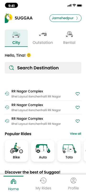
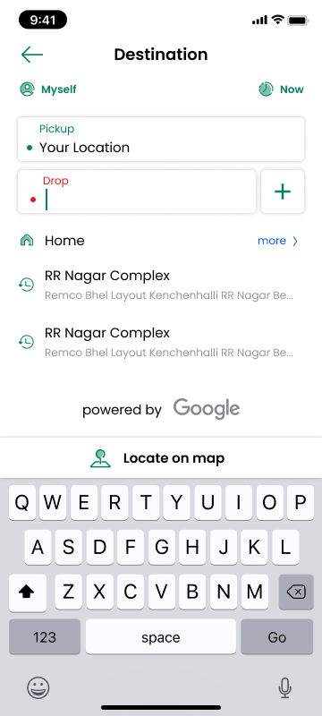
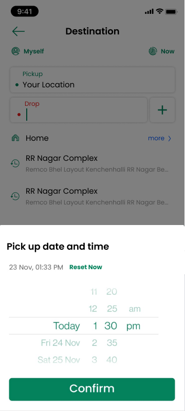
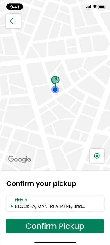
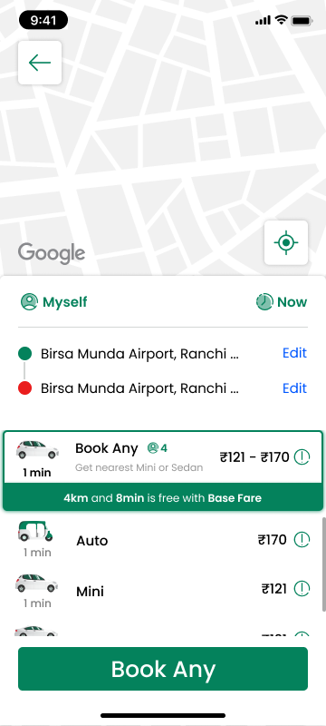
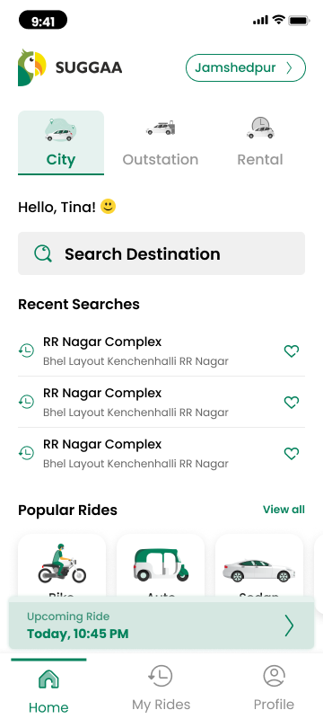
25,000+ riders across two cities — and a fleet that fits the street.
The rider app carried Suggaa from zero to 25,000+ riders in Jamshedpur and Ranchi, with Bengaluru and Delhi on the expansion map. Booking a toto for ₹30 and scheduling an outstation sedan live in the same flow — that range, priced honestly, is what made the product belong in its cities.
The rest of the story is in the series: the design system that kept three apps speaking one language, the Saathi driver app that kept the supply side alive, and the website that carried the pitch.
Five years of product design, team-building and city launches — this is what Embedded Leadership looks like.